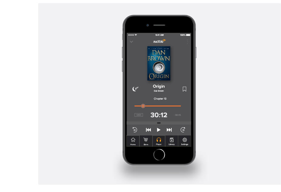
I set out to redesign Audible’s player interface (and the larger environment) because I was continually frustrated with the current player. This is the first screen of many that I will continue to work on.
Most of the time when I used Audible – either in my car in bed – I could only use one hand which made using the top hamburger menu difficult, and although the hamburger menu itself functioned, I felt like I had to tap too many times to traverse the different sections.
Aside from having a thumb-friendly bottom navigation (which could be hidden by a downward swipe), I also moved and removed several elements. For instance, the sleep timer is now to the left of the title; the playback speed setting is to the left of the timestamp. These two elements were previously accessible from the top menu.
I moved the wind and rewind buttons as I found them redundant to the +/- 30-second buttons. Plus, with the scrubber, I didn’t see the necessity of adding these elements to an already crowded screen area.
