Role: Senior Product Designer Client: Optum
Context
By the time I joined the medications work, the patient portal already had an MVP. The basics were live. What we hadn't yet figured out was the harder question: what makes a portal worth using — beyond once-a-quarter logins to check a lab result?
Medications were the obvious place to start. They're the thread running through chronic-condition care: prescribed, refilled, taken (or not), reviewed, adjusted. A portal that handled medications well would have a reason to be opened weekly, not quarterly.
The research
The literature on medication adherence is enormous, contradictory, and frequently abused by product teams who cherry-pick the parts that confirm their existing roadmap. So I started by reading. About 900 pages of journal literature on:
- Behavior change theory (BCT)
- Medication adherence and compliance
- Persuasive system design (PSD)
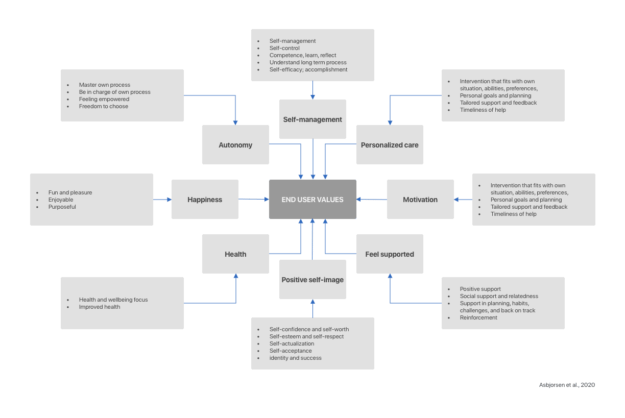
From this, I built mental models of how patients actually relate to their medications — pre-administration (deciding to fill, deciding to take) and post-administration (tracking, evaluating, adjusting).
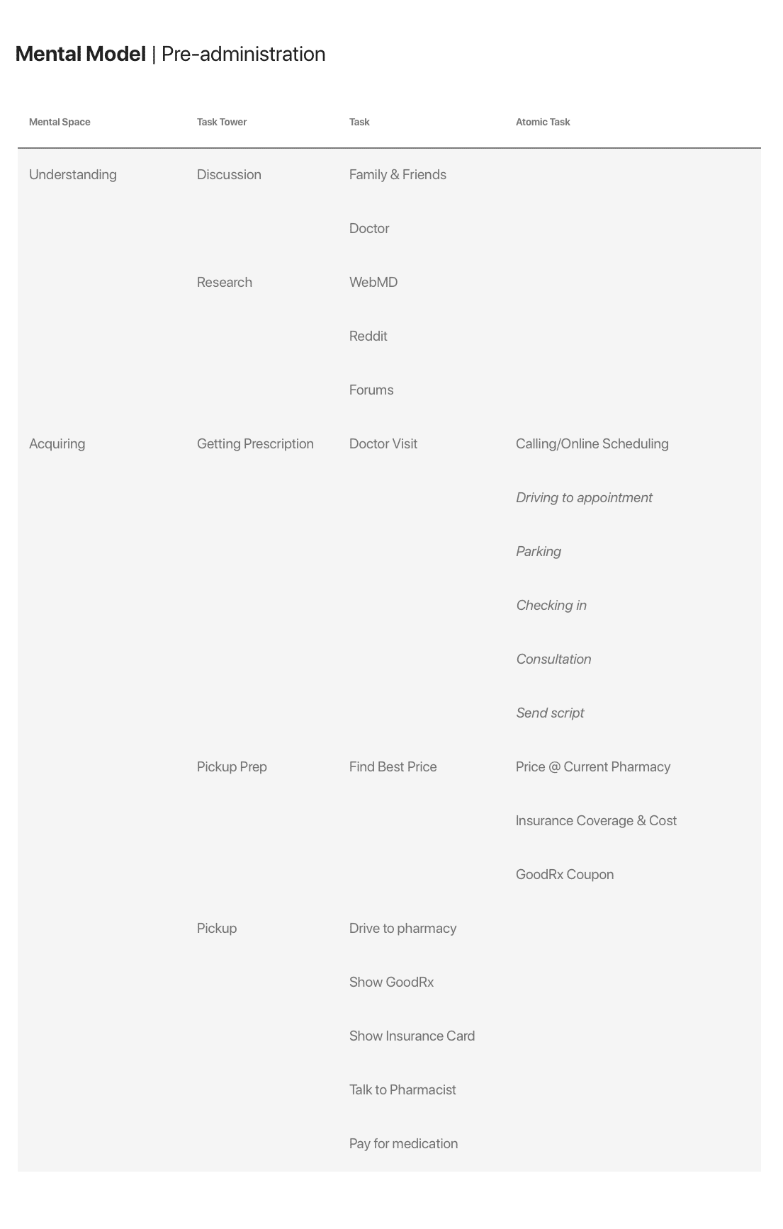
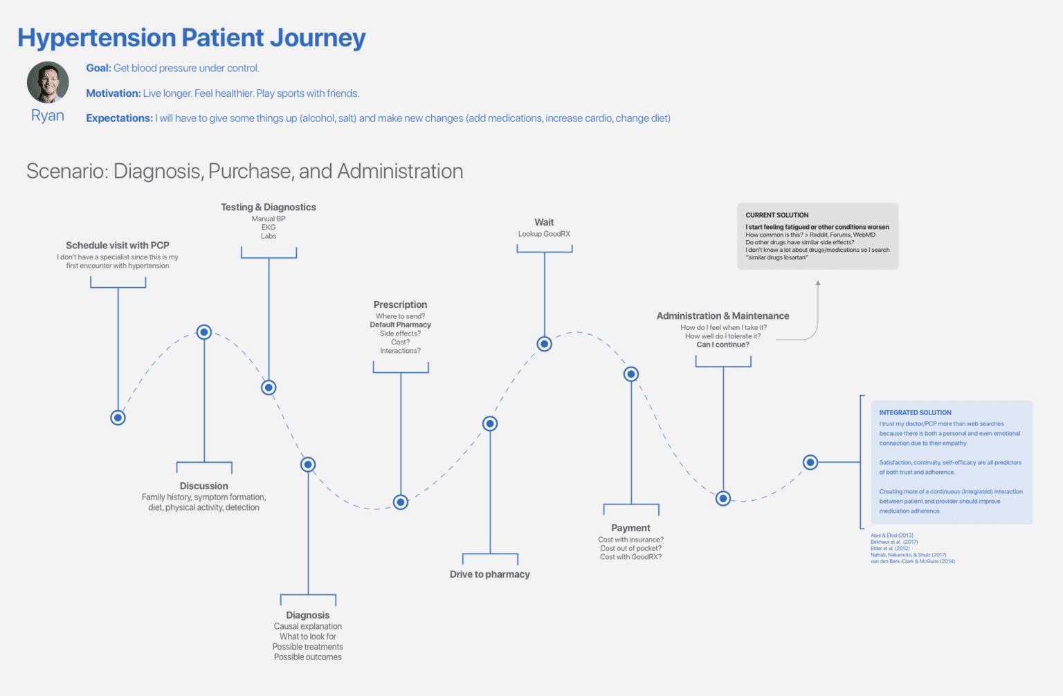
I then mapped journeys for hypertension medications specifically, since hypertension was a high-volume use case with well-documented adherence challenges.
The mental-model work surfaced the central design tension: portals tend to ask patients to report on medications. Patients want their portal to help them manage medications. Those are different products.
Solution
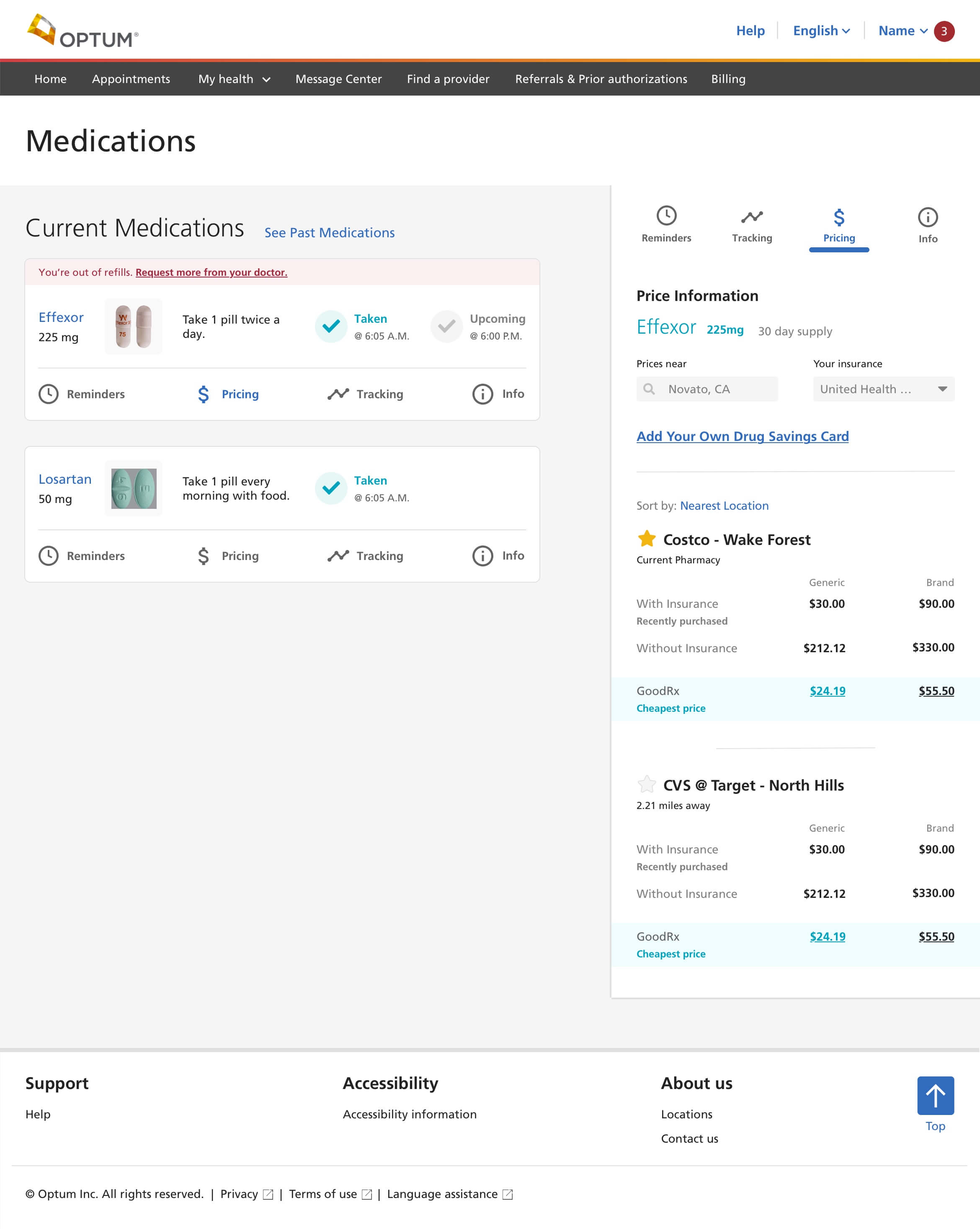
A medications homepage organized around the four things patients actually want to do:
- Refill quickly — including medications already at zero refills, which were causing the most friction
- Set reminders — built into the portal rather than relegated to a separate app
- Review interactions and side effects — surfaced proactively, not buried in detail pages
- Research alternatives — for cost, efficacy, or tolerability reasons
Each of these mapped to specific BCT/PSD principles — primary task support, dialogue support, system credibility — and each was iterated through multiple rounds of refinement, with information panels, tracking functionality, and collapsible content organization tuned to keep the homepage scannable.
What I'd take from this work
The most valuable thing the literature gave me wasn't a specific feature recommendation. It was the discipline of designing for the patient's actual decision points — the moments where they choose to take a medication, refill it, or stop. Those moments are where adherence is won or lost. Designing to support them is a different exercise from designing to display medication data.
A portal that supports decisions gets used. One that just displays information doesn't.