Role: Lead Clinical Product Designer Client: Kaiser Permanente
The brief
Kaiser needed a first-class, integrated patient/provider system for diabetes management — with the explicit requirement that the architecture extend cleanly to other diagnoses. This was a chronic-condition platform first, a diabetes platform second.
That framing mattered. Building a tool optimized purely for diabetes would have been faster, but it would have created a maintenance trap: every new condition would mean a new fork. Designing for the general case meant slower upfront work but a single coherent system over time.
Approach
The work followed Lean UX principles — short cycles, structured interviews with both clinicians and patients, rapid iteration informed by what we learned at each step. Initial research findings shaped subsequent rounds of questioning. We never assumed we understood what users needed; we assumed we'd be wrong and designed cycles to catch it.
Two questions guided the research:
- For clinicians: What information, in what density, and in what hierarchy, lets you make decisions faster — without losing the context that protects against errors?
- For patients: What does it mean to "manage" a chronic condition day to day, and what role can a portal play in that — versus what would just be one more thing to maintain?
The answers were different from what the team initially assumed. Clinicians wanted less data per screen, not more — but with sharper signals. Patients wanted clarity about what to do, not raw access to numbers.
Solution
Two integrated interfaces sharing a common architecture and language.
Clinician dashboard
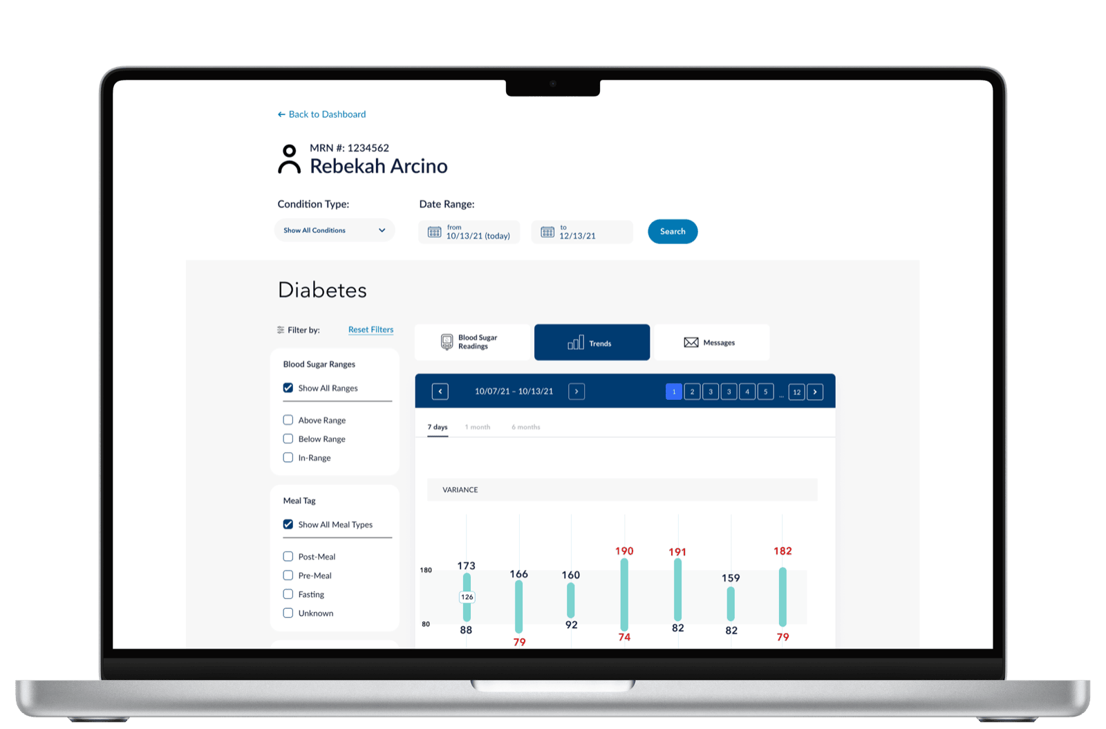
Diabetes-specific data visualization focused on what the clinician needs to act on. The variance bars surface the days where readings spiked outside range; the daily plot underneath shows the timing within those days. Together they answer two questions in one glance: was something off? and when?
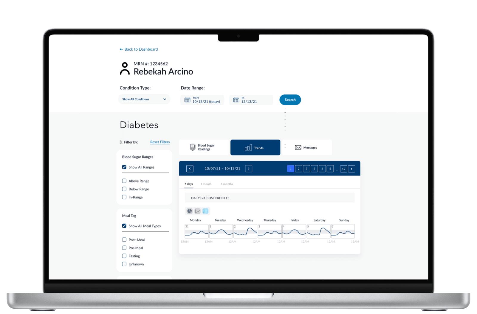
A second cut answers a different question — pattern recognition across the week. Each day gets its own glucose profile, lined up so the clinician can see whether mornings or evenings are consistently a problem.
The pattern — key metric, trend, decision support — was deliberately built to be reusable across conditions. Hypertension would use the same shape with blood pressure. Depression with PHQ-9 scores. The data changes; the cognitive scaffolding doesn't.
Patient mobile
Designed to inform decisions, not just display data. The mobile app uses the same in-range thresholds and the same week of readings the clinician sees — at lower density and tuned to a different question. The patient never has to interpret a chart; the screen tells them where they stand.
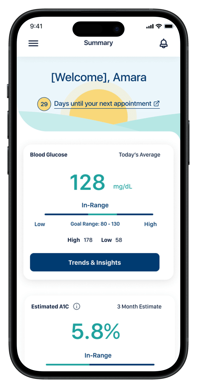
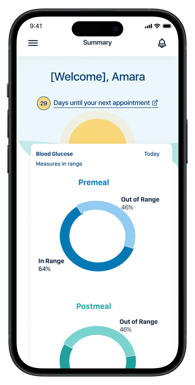
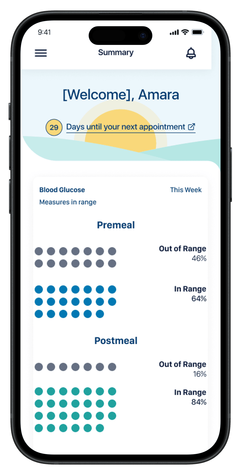
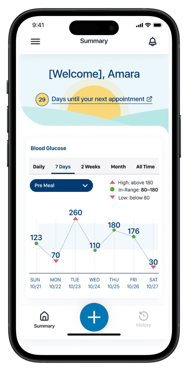
The four screens trace the patient's day-to-day question in order: where do I stand right now, how have my readings been distributed (two cuts of the same data — proportion vs. count), and how am I trending day by day. Same in-range thresholds, same week, same vocabulary as the clinician's screens. The integration is the point: when the patient and the clinician are answering different questions about the same data, the conversation between them gets easier.
The architecture pays off
Diabetes shipped first. But because the foundations were built for the general case, extending to other conditions became a configuration exercise rather than a redesign. Hypertension reused the same shape with blood pressure. Pregnancy — a fundamentally different time horizon and clinical model — picked up the same patterns: a clear primary state, a goal-anchored metric, a path to "what's next."
That's what designing for the general case actually buys you.
Why the dual-perspective design mattered
When patient and clinician are looking at versions of the same data — visually consistent, semantically aligned — conversations between them get easier. Patients arrive at appointments oriented. Clinicians don't have to re-explain what the patient is already seeing. The shared interface becomes a shared vocabulary.
Designing for both audiences with one underlying model was the project's hardest constraint and its most valuable result.