Role: Designer / Engineer (solo) Type: Personal project — full-stack ML pipeline + frontend Stack: React 18, Vite, TypeScript, Tailwind, Python ML pipeline (NBA, NFL, NHL, MLB, golf, tennis)
The system
TPM (True Prop Model) is a multi-sport sports-betting decision platform. The Python side ingests odds, generates simulations, and produces consensus model outputs across NBA, NFL, NHL, MLB, golf, and tennis. The React frontend is what sits on top — a dashboard for working with the model output to make decisions.
The interesting design problem isn't "how do we visualize sports data?" It's: how do we design an interface that helps a human user make better decisions when the underlying recommendations come from a probabilistic model that is sometimes confidently wrong?
That question shaped almost every UX choice in the dashboard.
The dashboard structure
Five primary views, each tuned to a different decision moment:
- Today — the daily front door. What does the model think is worth looking at now? Calibrated by recent performance, governance signals, and feed health.
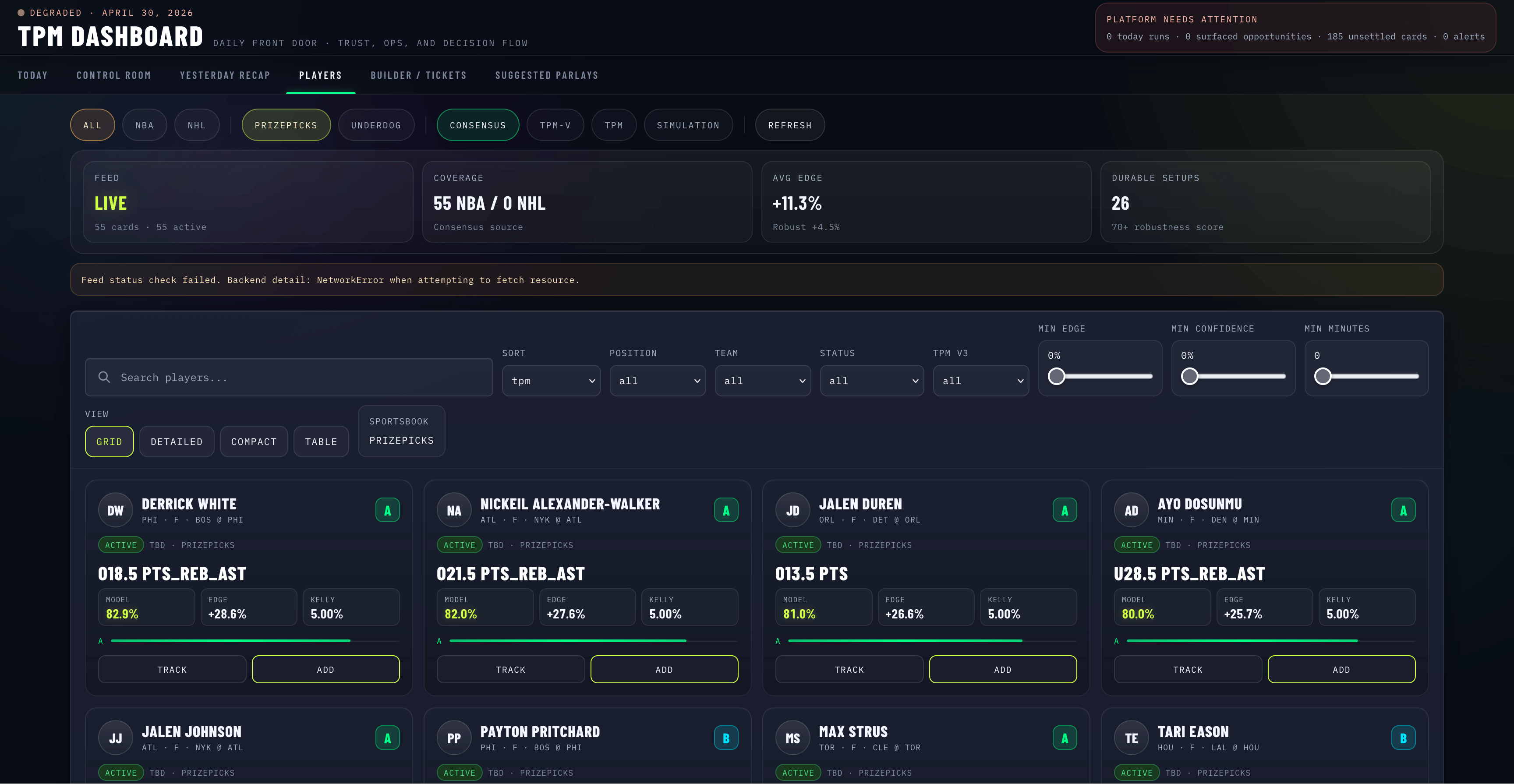
- Players — the searchable, filterable inventory. Filter by sport (NBA, NHL), source (Consensus, TPM-V, TPM, Simulation), and sportsbook (PrizePicks, Underdog).
- Builder — a parlay builder that surfaces correlation, EV math, and overlap warnings inline as you compose legs.
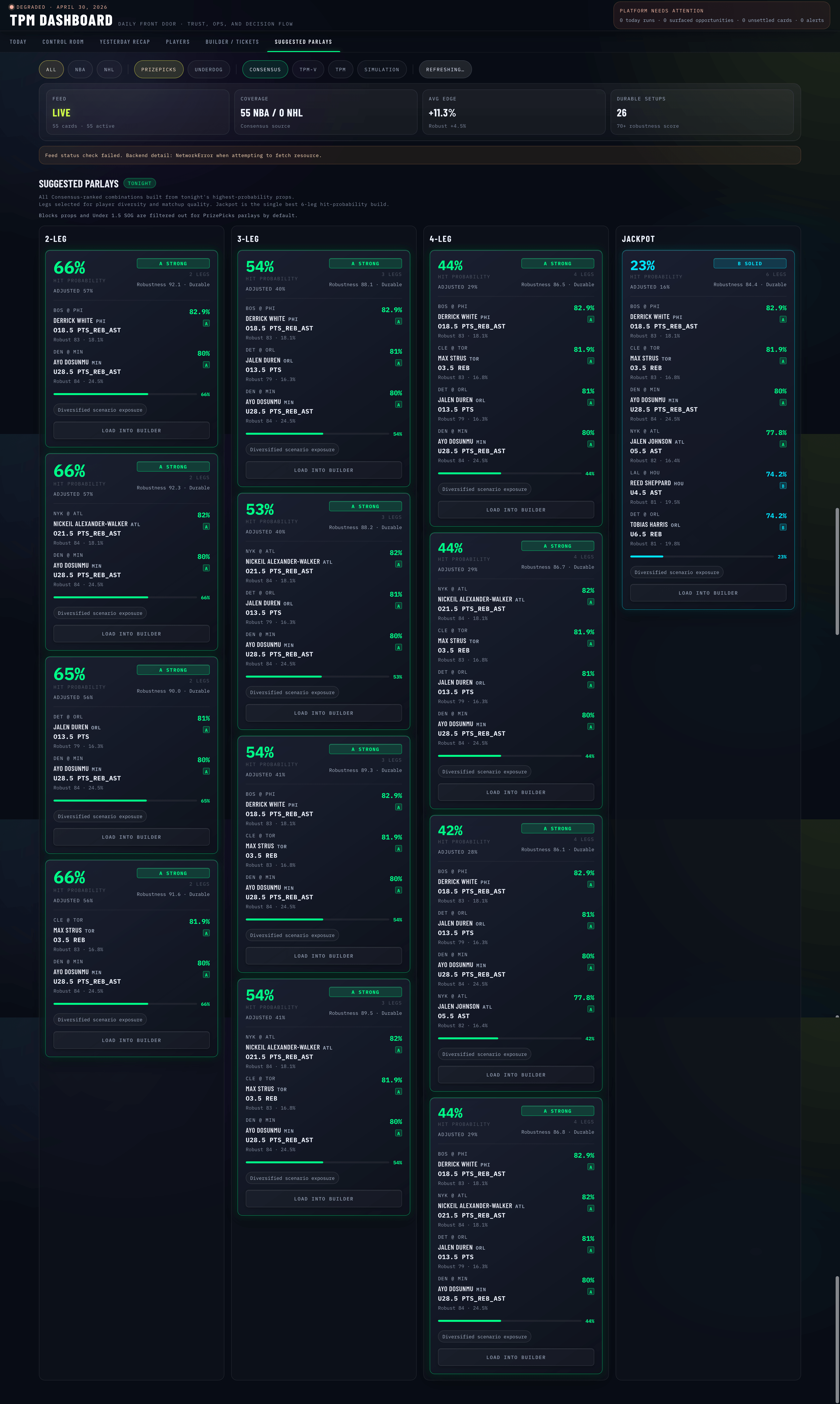
- Suggested — the model's own composition recommendations, presented as cards with explainers.
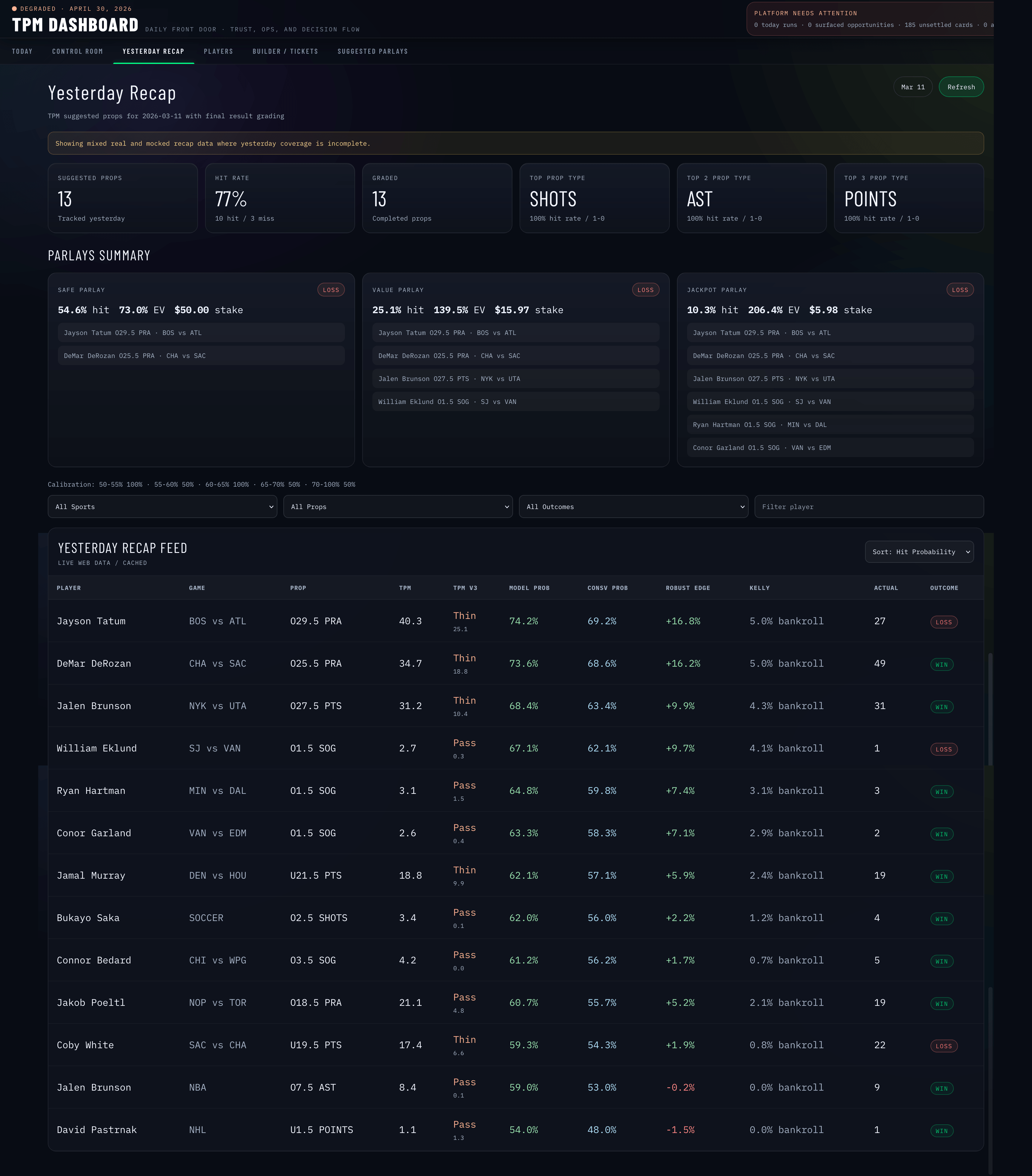
- Yesterday Recap — outcome review. What did we recommend? What hit? What didn't, and why?
A persistent parlay strip rides along the bottom of the screen across views, so the cart of decisions-in-progress never gets buried.
Designing for model uncertainty
Three design choices that mattered most:
1. Outcome review is a first-class view, not an afterthought. Most ML-driven products show recommendations and stop there. TPM treats yesterday's outcomes as their own UI — categorized by reason (model miss, market move, late scratch, data feed issue), so the user can see why something didn't work, not just that it didn't.
2. The Governance Control Plane. A view dedicated to model performance over time — calibration, feed health, slate health, archetype tuning. The point isn't to make the user a data scientist. It's to give them a legible picture of when the model is operating in its competence zone and when it isn't.
3. Sportsbook-themed shells. PrizePicks (yellow-green) and Underdog (purple) get distinct accent treatments. Not for branding alignment — for decision context. When you're building a PrizePicks parlay, the entire shell of the app shifts subtly. The constraints of that platform (fixed payout structures, multipliers) are different from Underdog's, and the design should remind you of that.
Information architecture
Nine domain hooks, each pulling a different slice of the model output:
useCards,useDailyReport,useFeedStatus,useGovernanceControlPlane,useOutcomeReview,useParlayBuilder,usePlayers,useRuns,useTrackedPicks
Each hook is responsible for one decision context. Components stay thin and don't know about API shapes. Drill-downs across views (e.g. clicking a flagged outcome to see the underlying governance slice) compose by passing selectors between hooks rather than by passing data.
The architectural principle: decision context is the primitive, not data type. A "player" object means different things in the Builder view than it does in the Recap view, so the hooks return decision-relevant projections rather than raw model output.
What this project proved out
When the product is decision support — not display — every UX choice has to be measured against "does this make the user's next decision better?" Pretty visualizations of probability distributions are easy. Designs that sharpen judgment under uncertainty are hard.
The same instinct that made the Optum medications work effective applies here: patients (and bettors) don't want a portal that displays data. They want one that helps them act. The product is the help, not the data.